Building your Email Content
This article goes through the different components you can use while building your email.
Required System Role: Standard User
Required Team Role: Editor and Comms Contributor
How to build your email content
Using our Comms: Email tool, you can create custom emails to send to Stakeholders and Users within your system.
This article will go in-depth into the different options you can choose from to build your email in the Build Email section of the Comms: Email feature.
After Clicking into the Content & Design section, it will expand and you will be presented with the Email Builder and the Send Test Email options.

Clicking the 'Edit Email Content' will take you to the Email Builder section which is explained in further detail below.
Email components
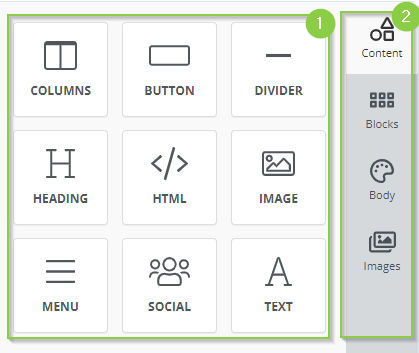
There are two sections of email components that help you configure your email as much as you'd like.
-
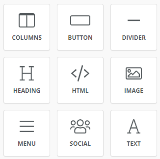
Building elements: These are the main building blocks of your email where you can add different sections with different types of content.
-
Overall Settings: These are the overall configurations of your email.
Building Elements
Each of these building elements can be dragged into the main editing section of the email to be used.
Left-click the element in the Builder options and drag it across to your workspace on the right.

Each of these elements provides different outcomes when entered into your email.
Columns
Columns allow you to separate different types of information into different sections.
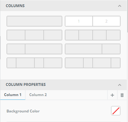
You can choose this option to create one or more columns and customise the elements in those columns.
The most common example is creating two columns with text on the left-hand side, and an image on the right.
Button
A button is a useful way to highlight to a recipient a separate website or hosted piece of information such as a project update website.
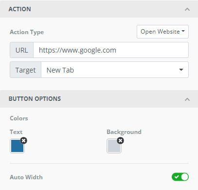
Other options include allowing the Stakeholder to email a specified email address, or call or SMS a phone number.
Clicking on the button in the main editing area will allow you to change the text on the button itself.
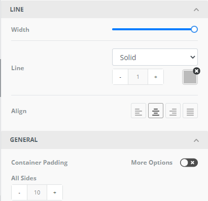
Divider
A divider can provide a different method of sectioning in your single email.
Heading
This is an option that allows you to create a heading for a section of your email.
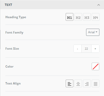
Editing of the heading text occurs in the main email builder area:

HTML
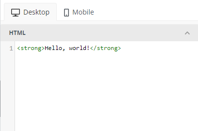
HTML allows those with HTML experience to enter custom code to have more control over the outcome.
Image
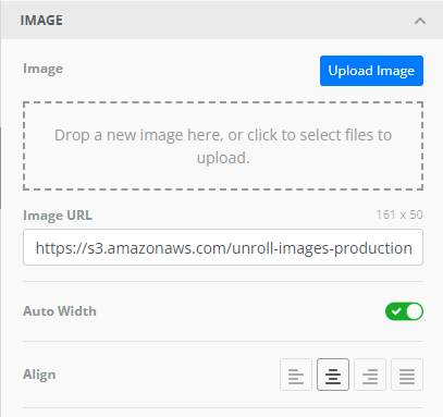
The image element allows you to upload or enter a hosted image's URL to enter it into the email.
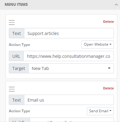
Menu
The menu option allows you to enter multiple links in a horizontal or vertical manner.
You can enter website links, email links, or phone call links.
Social
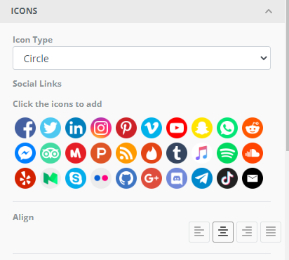
The Social option allows you to add an array of different social media links to your email.
Clicking on the relevant icon/s will allow you to enter your company's social link.
Text
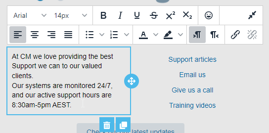
The text allows you to enter the relevant information into your email.
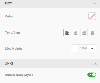
Editing of the content occurs in the main email builder area:
Example email
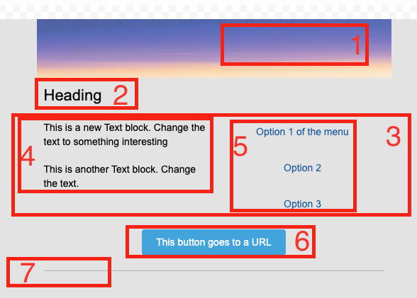
The screenshot below shows the different types of content you can enter into your email using the building elements above.
-
An Image used as an email header
-
A heading
-
Columns split into 2 content sections
-
Text in one column
-
Menu in one column
-
A Button
-
A divider
Overall Settings
The default section the build email section goes to is the content area, as that's where you can control the content of your email, but there are other overall settings that may be of use when customising your email content.

-
Content: This is where you can control the content in your email and the building elements are displayed and edited.
-
Blocks: This is another area where you can choose and add columns to your email.
-
Body: This is where you can control the selections of your overall email such as the background colour, and content width.
-
Images: This is where you can search for images owned by Creative Commons Zero which offers images in the public domain. *Note: This option may not be available for some systems.
