How to Generate Issues Over Time
Required System Role: Standard User
Required Team Role: Viewer
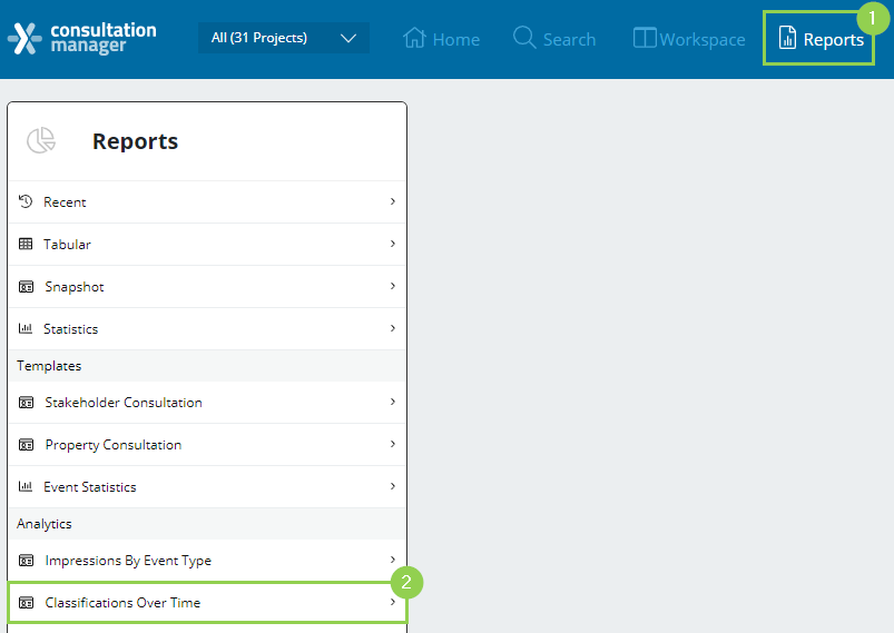
To use the Issues Over Time Report, click Reports (1) and Classifications Over Time (2).
Next, select the variables for your report.
NOTE: The graph will auto-generate as you select your variables.
You will be able to run this analytical report by choosing two variables:
-
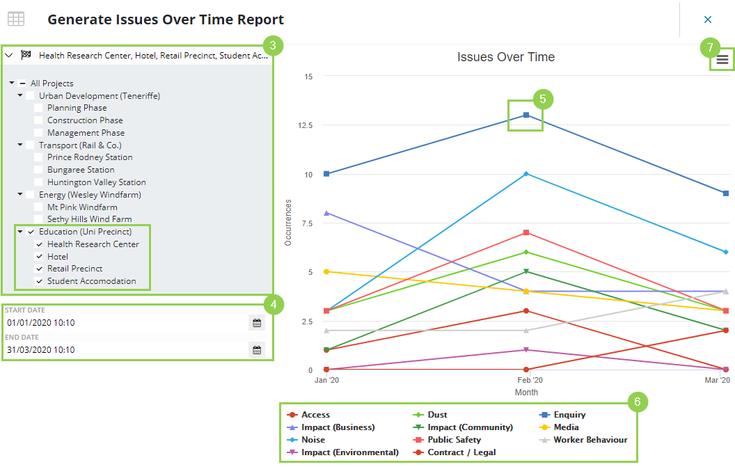
Projects: Define a Project selection to filter the displayed data to only Event Issues in those Projects.
-
Date: Select the date range of the Event Issues you are reporting on.
After selecting your variables:
-
Each point represents the occurrence count of an Event Issue. Differentiate issues through colours and symbols.
-
The graph legend shows which colour and symbol denote each Issue.
-
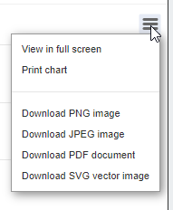
Other Options: Click this for more options. e.g. View in full screen, print or download in a different format.
Extra Tips
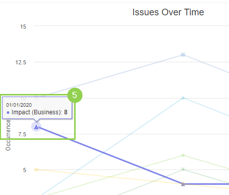
When hovering over a point, the Issue will be highlighted. A pop-up also appears, displaying the Issue name and how many times it has been reported for that month. This helps you differentiate between your Issues easily. See below (5).
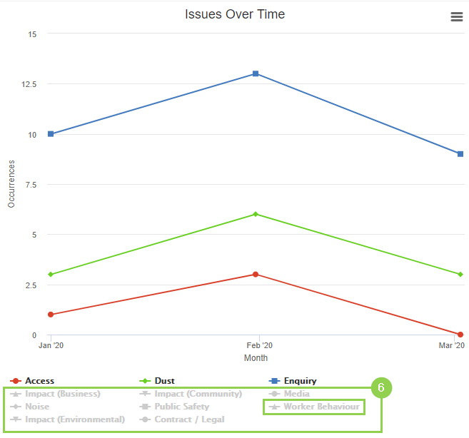
When you click the Issues in the Graph Legend (6), the word is greyed out and won't be displayed in the Issue Over Time Chart. This allows you to remove Issues you are not interested in and create a more refined graph.
