Issues Over Time Report
An analytical report that shows monthly data points
Required System Role: Standard User
Required Team Role: Viewer
What is an Issues Over Time Report?
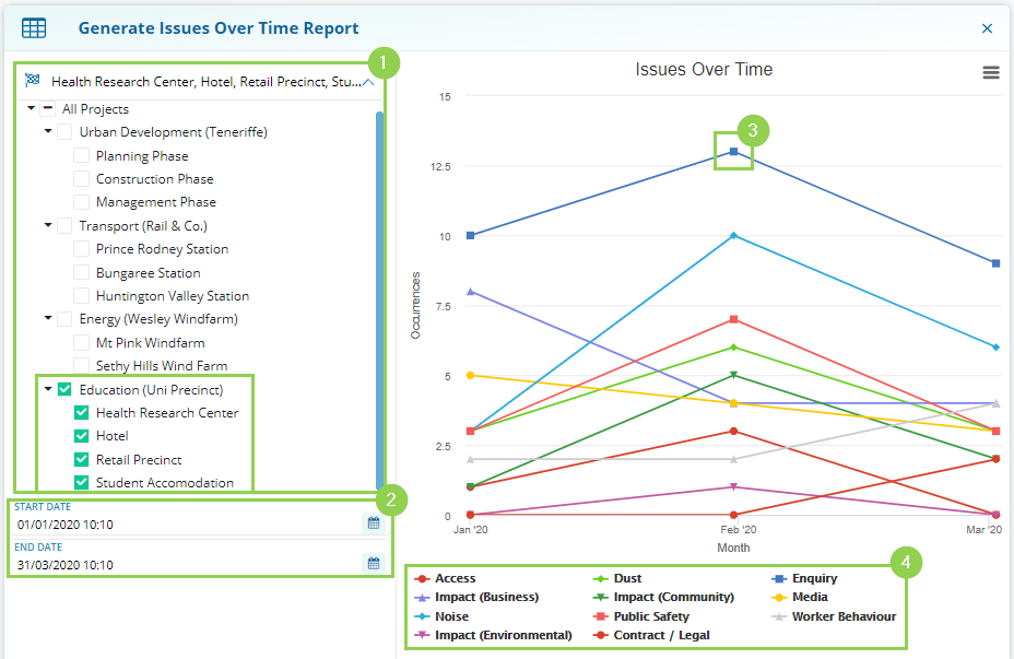
This analytical report shows the monthly occurrences of each Event Issue, giving you a visual trend of your Issues over time. The chart plots the total number of Events that reported the Issue within that month.
You will be able to run this analytical report by choosing two variables:
-
Projects: Define a Project selection to filter the displayed data to only Events linked to those Projects.
-
Date: Select the date range of the Events you are reporting on.
After selecting your variables:
-
Each point represents the occurrence count of an Event Issue.
-
The graph legend: Describes different issues and denotes their colours and symbols.
Each point represents the occurrence count of an Event Issue.
The graph legend: Describes different issues and denotes their colours and symbols.

Why use an Issues Over Time Report?

This visual analytical report allows you to quickly identify trends in Issues being raised by Stakeholders over time.
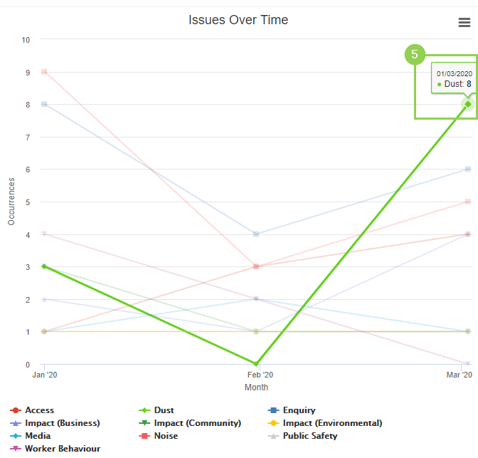
The chart allows to you recognise patterns such as a spike in a particular issue suddenly shooting up (5).
NOTE: The x-axis shows the timeline, grouped by month. A date range selection of the 22nd of May to the 30th of June (10 Days May, 30 Days June) may offer skewed results because the chart will only be displaying 10 days of May.
